Pie slide
The Pie slide type lets you create a visually appealing pie chart in your presentation by selecting specific board groups, a label column, and a value column. This slide type is perfect for showcasing proportions or distributions in your data.
Showcase
Watch a video to learn how to use the pie slide type:
Key Features
-
Label and Value Configuration: Choose a column for the label and another for the value to define the segments of your pie chart.
-
Group By Time Period: This option appears when a date column is selected as the label. You can choose a time period to group the dates in the label column: Day (default), Week, Month, Quarter, Half Year, or Year.
-
Calculation Options: Decide how to calculate the values of the pie chart: Sum (default), Average, Median, Min or Max
-
Display Settings:
- Show Value As: Customize how the value of each pie slice is displayed: Value (default), Percentage or Both
- Show Empty Values: Control whether slices with empty values are included in the pie chart legend. This feature is disabled by default.
- Show Default/Unassigned Values: Decide whether to include default or unassigned value in the pie chart. This feature is also disabled by default.
For information on supported columns for pie slides, refer to the Board Column Support section.
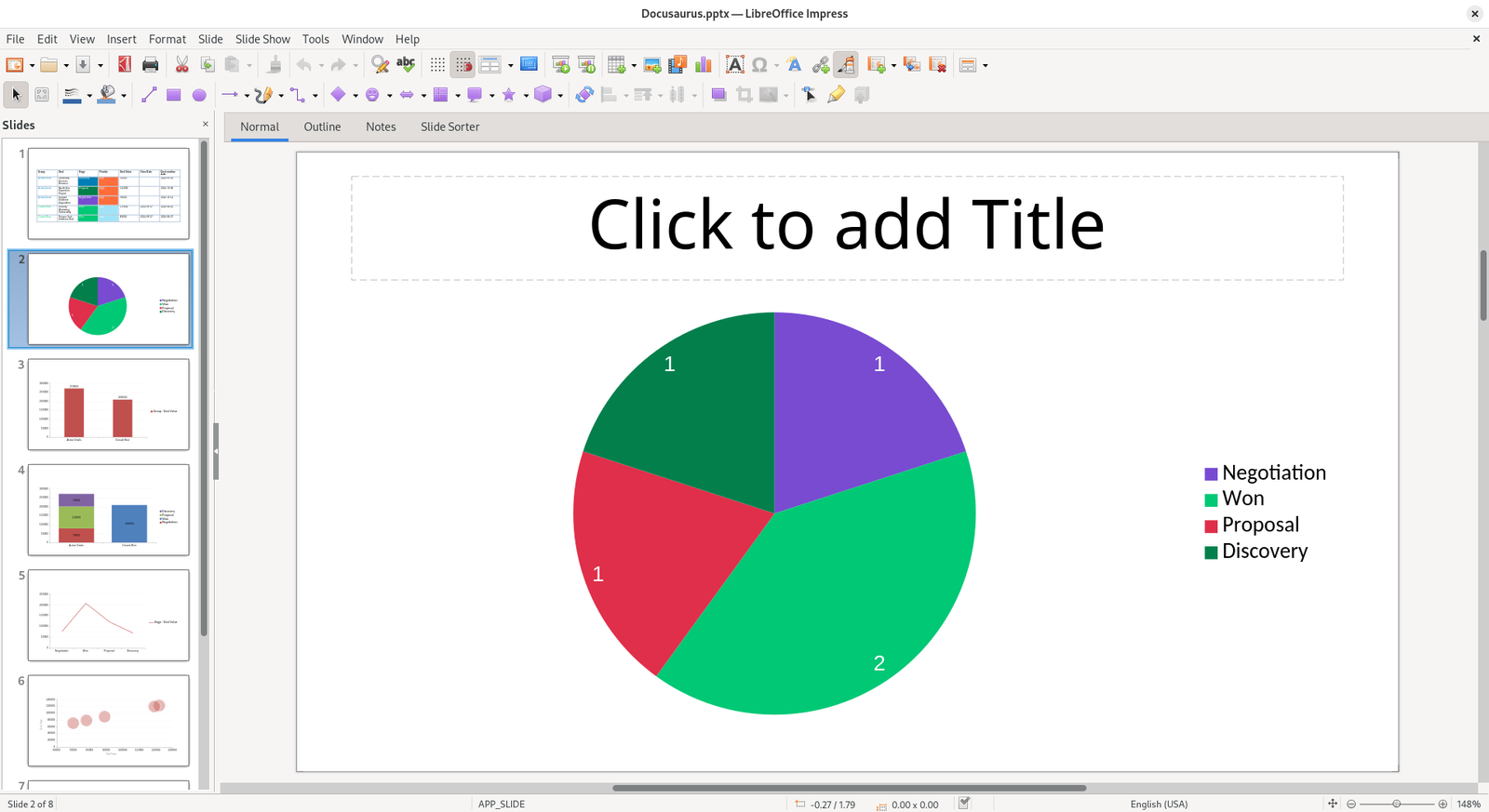
Example
Here’s how a pie slide will appear in your presentations: