Bar slide
The Bar slide type enables you to create a bar chart in your presentation by selecting specific board groups, an x-axis column, and one or more y-axis columns. This is perfect for visualizing comparisons or trends in your data.
Key Features
-
X-Axis and Y-Axis Configuration: Specify the column for the x-axis and one or more columns for the y-axes to customize your chart.
-
Group By Time Period: This option appears when a date column is selected as the x-axis. You can choose a time period to group the dates in the x-axis column: Day (default), Week, Month, Quarter, Half Year, or Year.
-
Calculation Options: Determine how y-axis column values are calculated: Sum (default), Average, Median, Min or Max
-
Display Settings:
- Show Empty Values: Decide whether to include x-axis column values that are empty. This feature is disabled by default.
- Show Default/Unassigned Values: Control whether default or unassigned x-axis value is displayed. This feature is disabled by default.
For details on supported columns for bar slides, refer to the Board Column Support section.
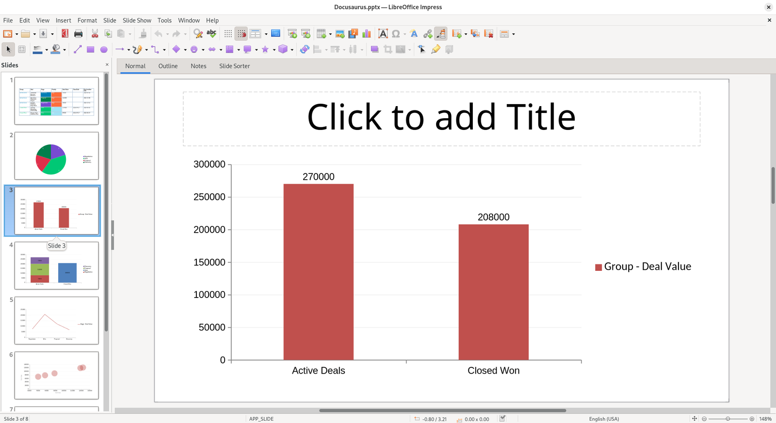
Example
Here’s how a bar slide will appear in your presentations: